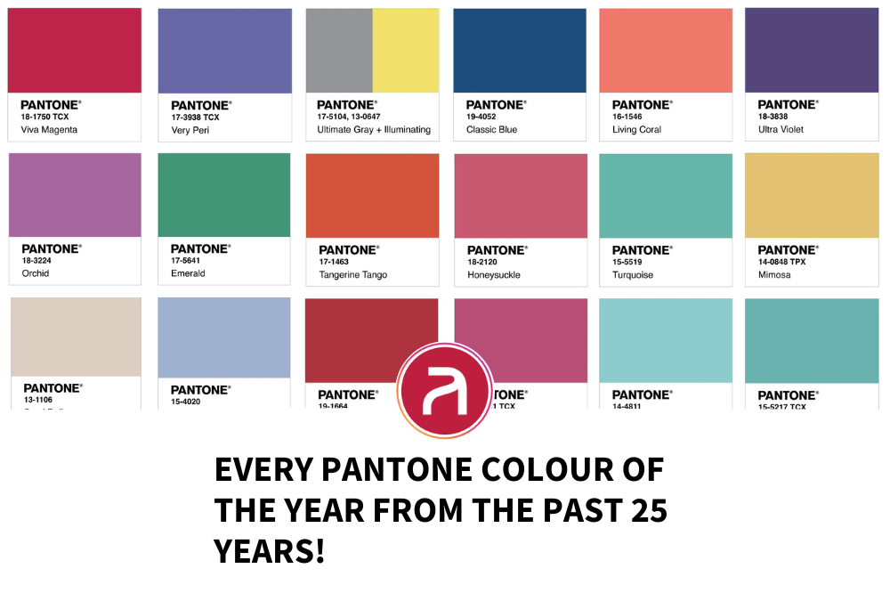
For the past 25 years, Pantone’s Color of the Year has served as more than just a hue—it’s been a mirror reflecting the pulse of society, industry trends, and collective emotions. From vibrant reds that symbolized resilience to tranquil blues offering comfort in uncertain times, each chosen shade has encapsulated the mood of its era. For the creative industry, these colors have shaped design, influenced branding, and inspired innovation, offering a lens into how global behaviors and market sentiments evolve. In this retrospective, we’ll explore each Color of the Year and uncover how these iconic shades have shaped and been shaped by the world around us.
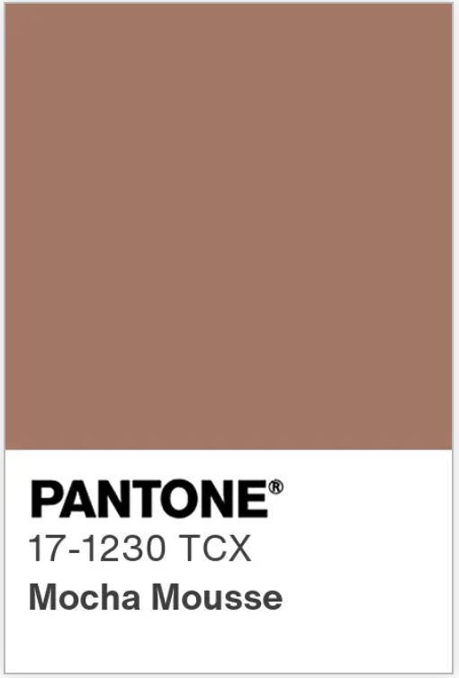
2025 – Mocha Mousse
A rich, chocolatey brown.
Mocha Mousse is all about comfort and connection. It’s a color that embraces calm and balance in a chaotic world, perfectly capturing a global mood of connection and harmony.
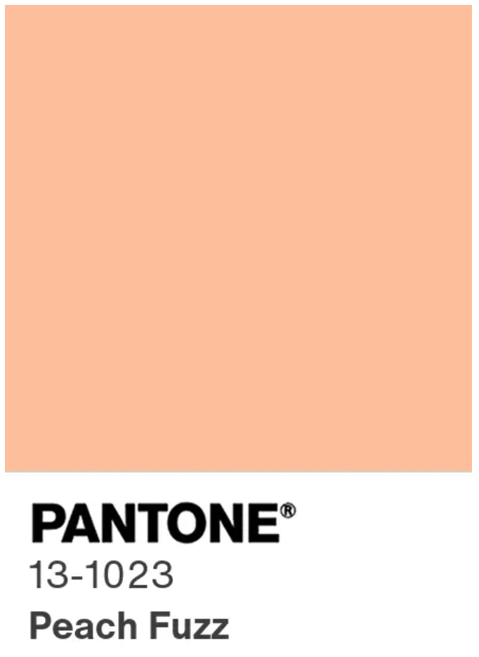
2024 – Peach Fuzz
A soft, inviting orange.
Apricot Crush brings warmth and optimism, reflecting the world’s need for joy and creativity in a post-pandemic world.
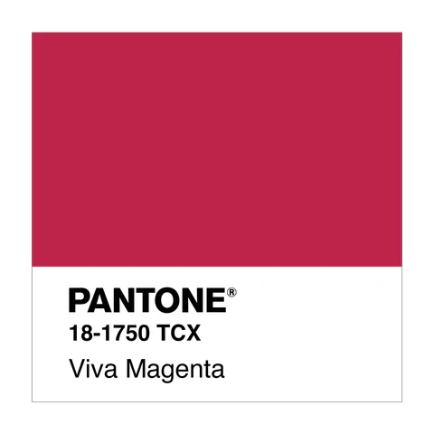
2023 – Viva Magenta
A vibrant red hue.
Viva Magenta was bold and full of life, pushing for change, strength, and the embracing of individuality and courage.
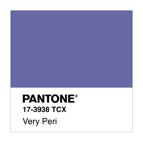
2022 – Very Peri
A periwinkle shade.
Very Peri was creative and dynamic, embodying a time when the world was embracing transformation and the power of imagination.

2021 – Ultimate Gray & Illuminating
A blend of gray and yellow.
These colours were chosen to represent resilience and hope. Ultimate Gray was steady, while Illuminating brought joy and light in dark times.
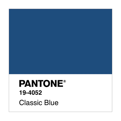
2020 – Classic Blue
A calm, dependable blue.
As the world faced unprecedented uncertainty with the pandemic, Classic Blue offered stability and peace, reflecting the need for calm in times of chaos.
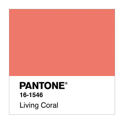
2019 – Living Coral
A warm, pink-orange hue.
Living Coral was vibrant and full of life, symbolising the need for optimism in a world facing environmental and political challenges.
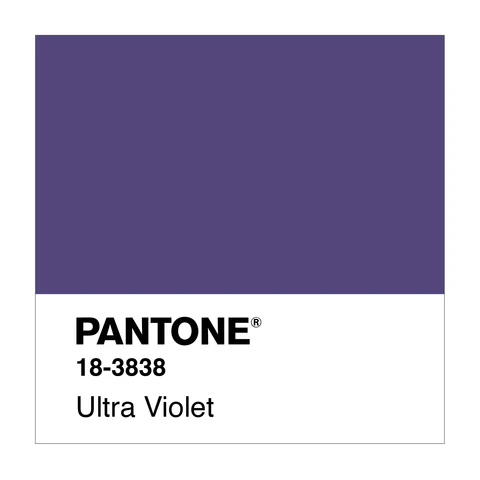
2018 – Ultra Violet
A deep, mystical purple.
Ultra Violet was dramatic and bold, symbolising a year of reflection and transformation, encouraging people to reach beyond their comfort zones.
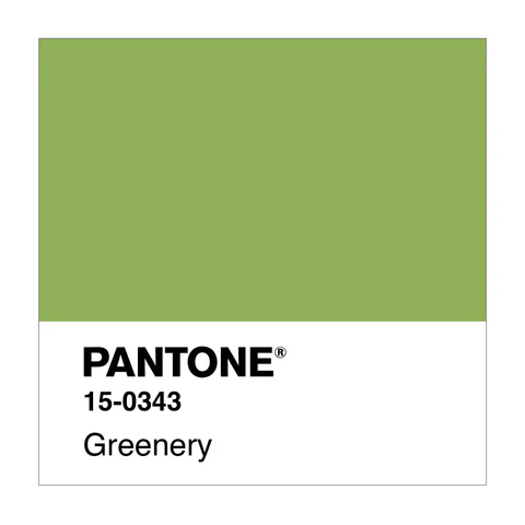
2017 – Greenery
A fresh, vibrant green.
Greenery was all about new beginnings, urging the world to reconnect with nature and focus on sustainability.
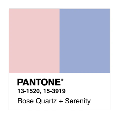
2016 – Rose Quartz & Serenity
Soft pink and tranquil blue.
These colours were chosen to symbolise balance and peace. They echoed societal movements for equality and unity.
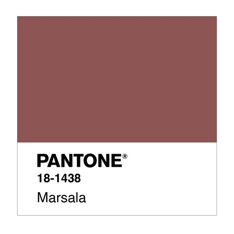
2015 – Marsala
A rich, earthy wine-red.
Marsala was the grounding colour for a year of self-reflection and connection. It felt luxurious and comforting.
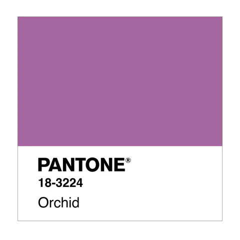
2014 – Radiant Orchid
A bold purple with pink undertones.
Radiant Orchid exuded creativity and originality, encouraging people to embrace their artistic side.
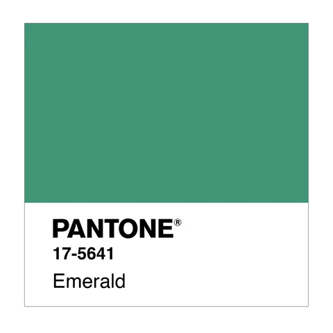
2013 – Emerald
A rich, lush green.
Emerald represented growth, renewal, and prosperity—a metaphor for the global economy’s slow but steady recovery.
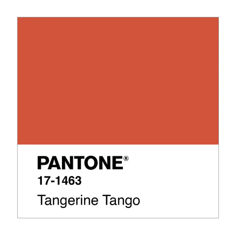
2012 – Tangerine Tango
A vibrant, reddish-orange.
This fiery hue screamed energy, symbolising a year where the world was ready to emerge from the economic crisis with renewed optimism and zest.
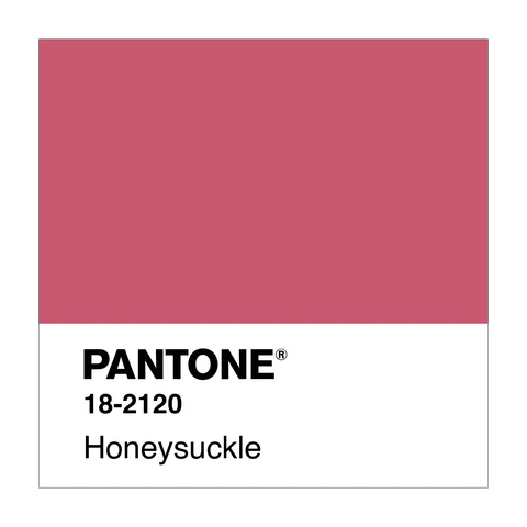
2011 – Honeysuckle
A lively pinkish-red.
Honeysuckle added warmth and energy, offering hope and vitality in the face of a lingering economic downturn.
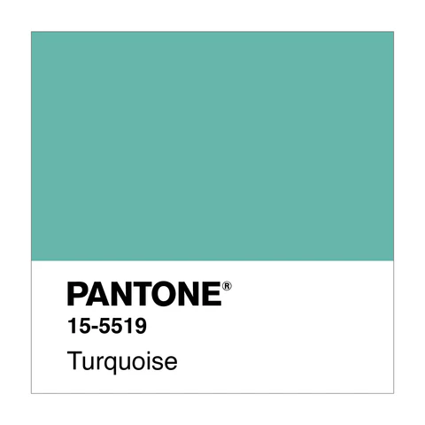
2010 – Turquoise
A calm, refreshing blue-green.
Turquoise conveyed a peaceful vibe after years of uncertainty, inviting a sense of escape and mental clarity.
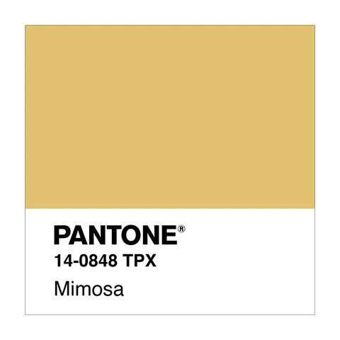
2009 – Mimosa
A bright, cheerful yellow.
Mimosa was all about optimism during tough times. The global economy was reeling, but this colour symbolised hope and a fresh start.
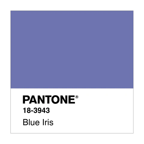
2008 – Blue Iris
A rich purple-blue.
Blue Iris was sophisticated, introspective, and spiritual, perfect for a time when people were starting to reflect more deeply on their roles in a global economy.
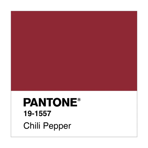
2007 – Chili Pepper
A spicy, intense red.
This year brought fiery energy into the fold. Chili Pepper ignited creativity and passion in everything it touched.
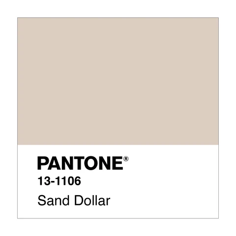
2006 – Sand Dollar
A neutral, sandy beige.
Sand Dollar embraced the minimalism and return to nature that dominated the mid-2000s. It brought a calming earthiness.
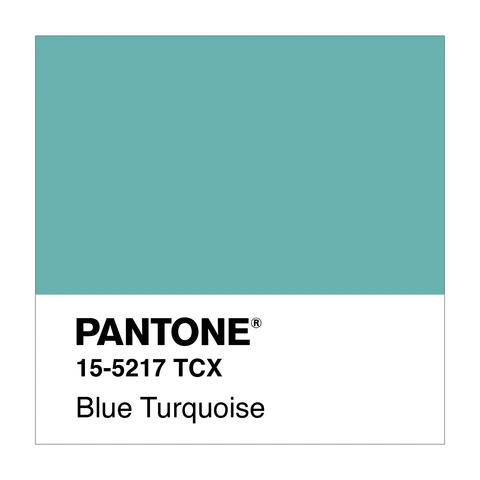
2005 – Blue Turquoise
A bright, yet calming turquoise.
Blue Turquoise captured the relaxed yet modern feel of the time, balancing creativity with tranquility.
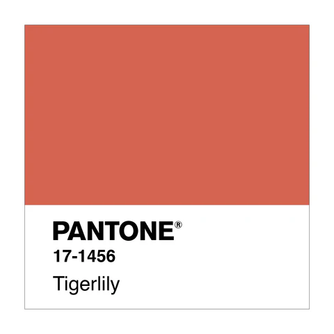
2004 – Tigerlily
A bold orange that signals confidence.
Tigerlily wasn’t shy! It represented a time of embracing excitement and bold ideas, much like the booming pop culture of the mid-2000s.
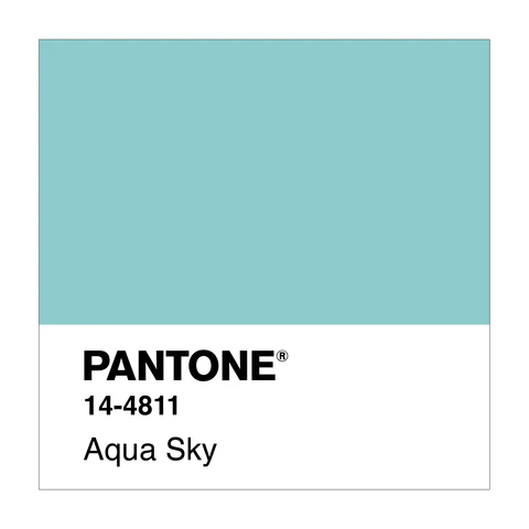
2003 – Aqua Sky
A cool, light blue that calms and refreshes.
After the intensity of the early 2000s, Aqua Sky was like a cool drink on a hot day — a refreshing, tranquil vibe.
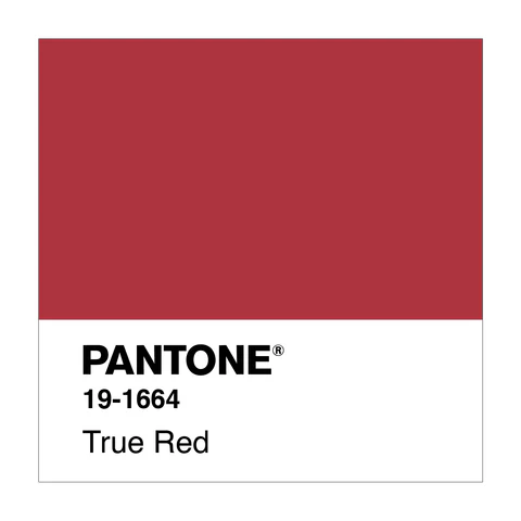
2002 – True Red
A bold and powerful red.
True Red was all about strength and passion, channeling confidence in uncertain times.
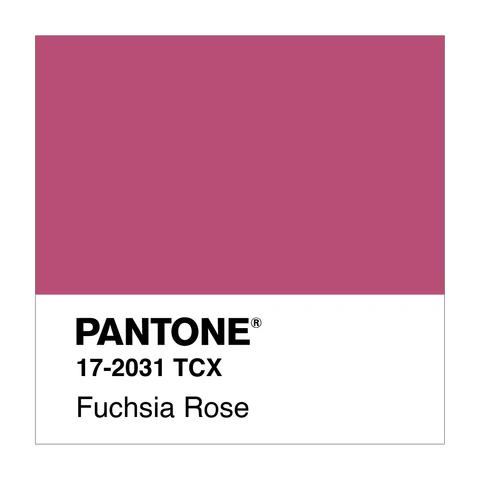
2001 – Fuchsia Rose
A bold, vibrant pink with a bit of purple.
Fuchsia Rose brought a vibrant spark of energy right after the turn of the millennium, showing the world wasn’t just ready to move forward but to thrive.
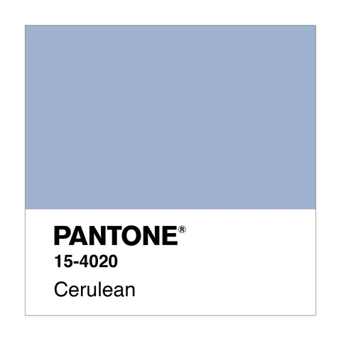
2000 – Cerulean Blue
A calm, cool blue reflecting the optimistic vibe of the new millennium.
This colour felt like a breath of fresh air, signalling a bright future as we entered the 21st century. It’s still a favourite for serene spaces.

