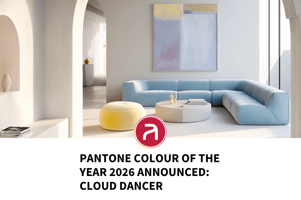
It’s got the Industry talking. Pantone has named Cloud Dancer (PANTONE 11‑4201) as the Colour of the Year for 2026, the first time its annual pick has been a shade of white.
They describe Cloud Dancer as a “billowy, balanced white imbued with a feeling of serenity,” a “blank canvas” that offers calm and clarity in a busy, overstimulated world.
Where many expected bold, saturated colours for 2026, Pantone has instead chosen subtlety, lightness and space, a shift that reflects broader cultural undercurrents.
Why White and Why Now
A Return to Calm
In a world saturated with noise (digital, social, cultural), white offers a visual and mental pause. Pantone frames Cloud Dancer as a refuge from distraction — a chance to reset, reflect, and breathe.
The choice feels especially resonant for 2026, as many creative professionals are navigating burnout, fast-paced workflows, and ever-changing client demands. A neutral shade suggests a collective longing for clarity, calm, and creative space.
A Blank Canvas for Creativity
Cloud Dancer isn’t about what it is. It’s about what it can become. As white, it’s a background, a foundation on which stories, visuals, experiences, and products can be built.
For creatives, that means it’s versatile: you can apply it to interiors, digital interfaces, film, fashion, branding — anywhere. Its neutrality makes it a kind of silent partner: it supports rather than competes.
A Reaction to Excess and Complexity
In recent years Pantone’s picks have ranged from warm earthy tones to vivid, expressive hues. Cloud Dancer departs from that and that matters. It’s not just minimalism for aesthetics, it feels like a mood shift. Amid global uncertainty, economic anxiety, and cultural overload, perhaps people want less noise, less flash, and more thoughtfulness.
How the Industry Is Reacting — From Excitement to Eye Rolls
The response to Cloud Dancer has been mixed.
On one hand, many are embracing it. Interiors, fashion, product design and branding will likely see renewed interest in light, soft palettes. A white base offers contrast, clarity, and an opportunity for colour pops, experimental overlays or bold typography. Several design publications describe the choice as a breath of fresh air — a space for creativity to start anew.
On the other hand, some critics call it “safe,” “predictable,” or even “uninspired.”
But whether loved or loathed, Cloud Dancer is already shaping discourse and influencing what creatives and brands will produce next year.
What 2026 Might Look Like for Creatives & Clients
If Cloud Dancer becomes a foundational hue for 2026, here are a few predictions for what the next 12–18 months may bring.
- Minimalist + Light-Filled Design Interiors and Spaces — soft whites, neutral textures, airy atmospheres. Ideal for studios, coworking spaces, lifestyle brands.
- Calm & Clean Digital Experiences — UX/UI design may favour white-based palettes, subtle translucency, minimalist layouts, “breathing room” on screens.
- Product & Branding Focus on Contrast — Cloud Dancer as a base with accent colours to stand out. Neutral branding with pops of bold colour or typography for impact.
- Flexible Canvas for Storytelling & Visual Experimentation — white allows creatives to layer motion, AR/VR, generative aesthetics, and interactive design over a clean background.
- A Shift Toward Emotional Clarity in Creative Work — products, campaigns, and content that focus on calm, sincerity, and introspection rather than overstimulation or spectacle.
Ideas & Formats to Use Cloud Dancer (For Freelancers, Agencies, Brands)
If you’re a creative, designer, developer, art director, content‑creator — or you’re working with clients or brands, here are some ideas to leverage Cloud Dancer in 2026:
- Use Cloud Dancer as a background canvas for motion graphics or animated content — the neutral white makes colours and movement pop.
- Design brand refreshes centred around minimalism and softness — perfect for wellness, lifestyle, sustainability, or boutique brands.
- Create web/app UI themes rooted in airy whites and subtle contrast, with accessible, readable typography and clean layouts.
- Offer modular branding kits: a “blank canvas” base + optional accent palettes to suit any mood — ideal for agencies pitching flexible, modern brand identities.
- Explore immersive experiences / spatial design — white interiors with pastel or transparent overlays, mood lighting, slow animation: calming but futuristic.
- Leverage white’s versatility for product photoshoots / packaging mockups: gives products space to breathe and stand out.
What This Means for Artisan, Freelancers & Businesses
As a recruitment agency working in the creative and digital space, we see Cloud Dancer as more than a trend — it’s a signal.
For freelancers and creatives, it’s time to think about light, space, neutrality, and subtlety. These are the skills and sensibilities that will matter: not just bright colours or loud visuals, but restraint, clarity, and design that lets content shine.
For businesses and clients, this is a chance to reposition branding, UX, and creative direction toward calm, trust, and longevity. A white-based aesthetic is easier to iterate, more timeless, and often cheaper to implement — which matters in uncertain markets.
At Artisan, we’re starting to talk with clients about building creative teams ready not just for flashy campaigns, but for thoughtful, considered design. We’re helping place talent who can design with restraint, who understand user experience, who know typography, space, light and who can make “less” feel like “luxury.”
If you’re a creative wanting to align with 2026’s mood, or a client looking to translate this shift into your brand identity, drop us a line.