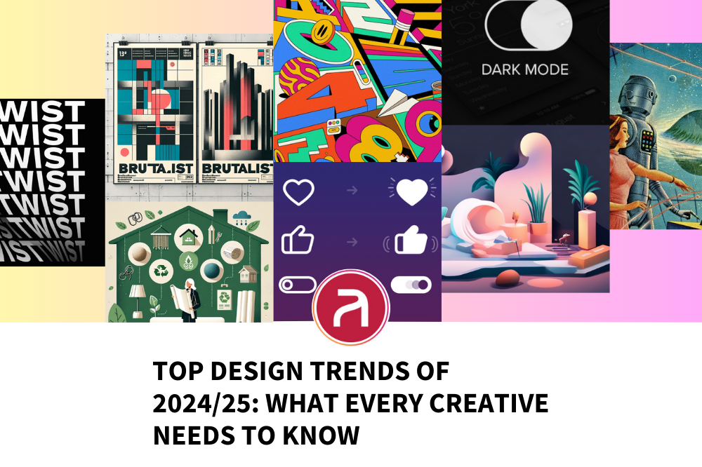
As we are well into 2024 and 2025 is just over the horizon, the creative industry continues to evolve at lightning speed, and it’s clear that designers who stay ahead of the curve will thrive in this competitive landscape. From bold new graphic design elements to seamless web experiences and avant-garde digital art, the design trends of 2024/25 are shaping the future. If you’re a designer, you’ll want to keep your portfolio fresh and cutting-edge, and if you’re a client, you’ll want talent that’s on the pulse of these shifts. Let’s break down the hottest design trends you need to know about—and how Artisan can help you incorporate them into your projects or find the right talent to lead the charge.
1. Maximalism: More is More!
Minimalism has officially taken a backseat in 2024 as Maximalism steps into the spotlight. Bright colors, bold patterns, and intricate, overlapping elements are now the go-to for many brands aiming to stand out. Designers are using this trend to craft visually rich experiences that spark curiosity and excitement.
- Why it works: In an era of digital saturation, people want designs that grab attention immediately. Maximalism brings energy, playfulness, and personality to a brand’s visual identity.
- Example: Take a look at Spotify’s vibrant, playlist covers. They’re using maximalist designs that pair eclectic typography with high-energy visuals to hook audiences at first glance.
Incorporate it: Try bold typography, layered textures, or multi-dimensional graphics in your projects. Go wild with colors and embrace quirky layouts! If you’re a designer looking to flex your creative muscles, this is the perfect playground. Keep your portfolio fresh by experimenting with this vibrant, head-turning style.
2. 3D Elements and Realism
3D design is making waves in 2024, becoming a standard in digital spaces from websites to product design. Brands are increasingly utilising 3D objects, animations, and hyper-realistic imagery to create immersive experiences. The mix of both virtual and physical realities is blurring the lines of what’s possible, especially in AR/VR experiences.
- Why it works: It creates a more engaging and interactive visual experience, especially when merged with augmented reality or product showcases.
- Example: Check out the homepage of Nike, which uses 3D visuals to bring their shoes to life in a way that static images simply cannot.
Incorporate it: Tools like Blender and Cinema 4D are becoming must-knows for designers. Even simple 3D elements, when integrated into websites, can make your work stand out in a client’s eyes. At Artisan, we know that finding talent with these 3D skills is crucial—whether you’re looking for freelance or permanent roles, we’ve got designers who specialise in these next-gen visuals.
3. Sustainability and Eco-Aesthetic
The conversation around sustainability has moved into the design world with eco-aesthetics becoming a dominant trend. Designs that incorporate natural, earthy tones, recycled textures, and visuals inspired by nature are now leading the way. Many brands are prioritising sustainability in their brand messaging and using design to reflect their values.
- Why it works: With the increasing demand for environmentally conscious choices, brands are turning to eco-friendly design as a way to connect with socially conscious consumers.
- Example: The Patagonia website is a masterclass in minimalist eco-design, with muted palettes and natural imagery to reflect their environmentally friendly brand values.
Incorporate it: Use neutral color palettes, organic shapes, and texture-rich visuals that remind viewers of nature. Not only will this make your work feel fresh, but it also aligns with the rising demand for socially responsible brands. If you’re a client looking for a designer who understands the eco-conscious movement, reach out to Artisan. We have the right talent to make your sustainability projects visually impactful.
4. AI-Driven Design
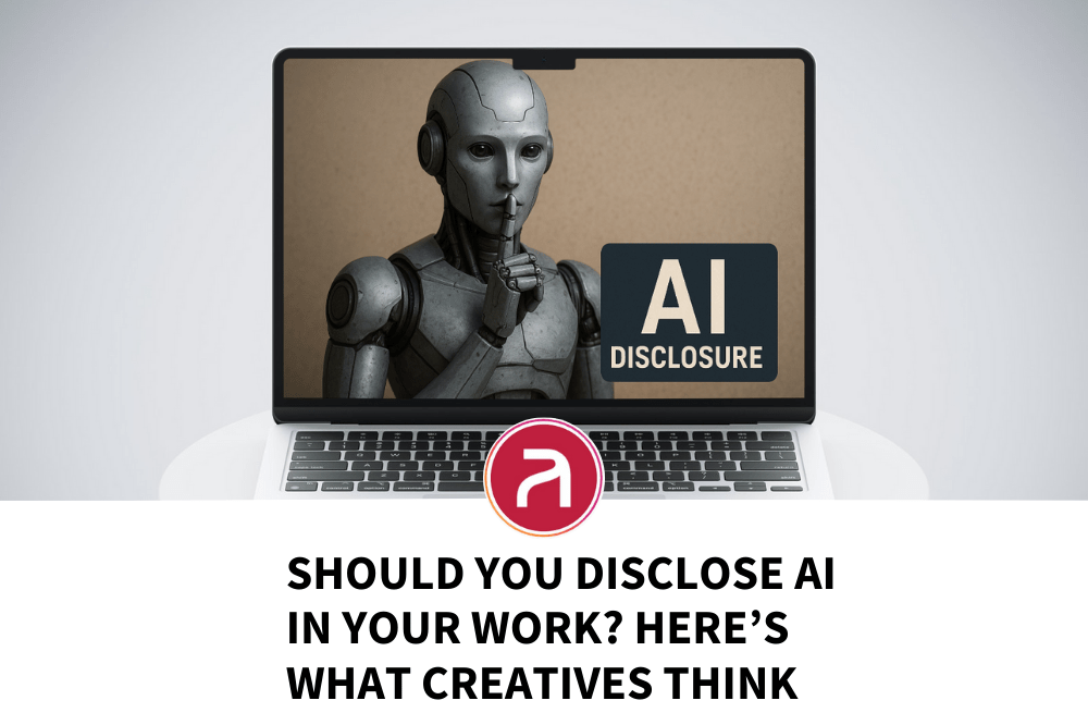
Artificial intelligence isn’t just a buzzword anymore—it’s transforming the design industry. From generative art to automated design tools, AI is helping creatives produce work faster while maintaining high quality. In 2024, AI is being used in branding, UI/UX design, and even in generating complex digital art.
- Why it works: AI enables designers to experiment at a rapid pace, streamlining workflows and allowing for more focus on creativity rather than repetitive tasks.
- Example: Tools like MidJourney and DALL·E are helping designers create intricate illustrations and concept art in a matter of minutes. Explore their communities to see some jaw-dropping examples of AI-generated designs.
Incorporate it: Start incorporating AI tools into your creative process, whether it’s generating mockups, mood boards, or visual concepts. At Artisan, we understand how fast this technology is evolving and can connect you with designers who are already using AI tools to their full potential.
5. Retro-Futurism: Past Meets Future
In 2024, we’re seeing a resurgence of Retro-Futurism, a style that combines nostalgic design elements with futuristic twists. Think of 80s and 90s inspired color schemes and graphics paired with futuristic typography and sleek interfaces. It’s an aesthetic that both reminds people of the past and pulls them into an exciting, tech-forward future.
- Why it works: It taps into the current obsession with nostalgia while projecting the future of design. Audiences are drawn to the familiar, but with an innovative edge.
- Example: Look at the branding for Stranger Things, which uses this trend in their posters, combining 80s fonts with modern digital effects.
Incorporate it: Try blending neon colors, grid-like layouts, and futuristic fonts in your projects. Bring in some grainy textures or VHS effects to give that retro vibe with a modern spin. If you’re a creative looking to explore this trend further or a client searching for a designer with a retro-futuristic approach, Artisan has a roster of trend-savvy creatives ready to help.
6. Kinetic Typography: Words in Motion
Kinetic typography, or animated text, has surged in popularity as a way to grab attention and convey messages dynamically. Motion graphics are no longer just for video intros or social media ads—designers are integrating animated typography into websites, apps, and even branding.
- Why it works: Moving text captivates users, helping brands communicate their message in a more engaging way. It creates an energetic feel and holds attention much longer than static text.
- Example: Look at Apple’s latest product launches—animated type paired with sleek, dynamic visuals heightens the user experience, keeping viewers hooked as they scroll through new product features.
Incorporate it: Try incorporating kinetic typography into your web design or social media assets. Use tools like After Effects or Figma’s animated plugins to get started. At Artisan, we know clients are looking for creatives skilled in motion design, so if you’ve got these skills or want to develop them, we can help connect you with exciting opportunities.
7. Dark Mode Dominance
While dark mode has been around for a few years, 2024 is the year it’s become a must in web and app design. As more users prefer dark mode for its sleek appearance and reduced eye strain, brands are shifting their design focus to ensure compatibility with both light and dark themes.
- Why it works: Dark mode is easier on the eyes, reduces battery consumption on devices, and creates a modern, stylish aesthetic. It’s increasingly becoming a default for many users.
- Example: Check out Instagram, which offer seamless dark mode options that enhance user experience without sacrificing visual quality.
Incorporate it: Designers need to create adaptable color schemes and designs that look great in both dark and light modes. Adding dark mode variations to your portfolio showcases your flexibility and awareness of user preferences. Artisan can help you find projects that focus on UX and UI design with this trendy feature.
8. Brutalism: Raw and Unfiltered Design
Brutalism, characterised by its raw, unpolished, and almost aggressive aesthetic, is making a comeback. It’s often seen as a rebellion against overly polished, “cookie-cutter” web designs, bringing in large, blocky layouts, harsh contrasts, and minimal colour palettes.
- Why it works: This trend makes a statement and is perfect for brands that want to stand out by being deliberately unconventional. It challenges standard design norms and appeals to audiences looking for something different.
- Example: The Bloomberg Business website uses a brutalist approach with large, blocky text, simple black-and-white colour schemes, and unpolished elements. This helps communicate that the content is straightforward and serious without the fluff.
Incorporate it: Experiment with brutalist layouts by stripping back unnecessary elements, embracing asymmetry, and going bold with type and color. If you’re a designer with a love for pushing boundaries, adding brutalist designs to your portfolio can help you stand out. Clients looking for this bold, rule-breaking aesthetic will find the right talent through Artisan.
9. Micro-Interactions: Delight in the Details
Micro-interactions are the subtle animations and feedbacks users get when interacting with digital interfaces. Whether it’s a button changing colour upon hover or a subtle sound effect when a task is completed, micro-interactions bring an extra layer of delight to web and app design in 2024.
- Why it works: These tiny design elements improve user experience and make interactions feel more intuitive, engaging, and rewarding. When done right, they create a sense of satisfaction.
- Example: The Slack app is a great example of this trend, with playful, engaging micro-interactions that make the communication platform more fun and enjoyable to use.
Incorporate it: Think about the small details—hover effects, subtle animations, or sound cues—that can enhance user engagement. At Artisan, we know that clients increasingly value UX designers who understand the power of micro-interactions to elevate their products.
10. AI-Generated Art
The rise of AI-driven tools has opened the door to a new world of AI-generated art, and it’s becoming a major trend in 2024. Designers are using tools like DALL·E and Runway ML to create unique, complex visuals with minimal effort, and then tweaking these pieces to add their own creative touches.
- Why it works: AI art saves time and offers endless creative possibilities, helping designers work faster and generate a wide variety of styles. It’s also pushing the boundaries of what’s possible in the digital art world.
- Example: The latest designs by Levi’s have used AI-generated textures for their denim collections, blending machine creativity with human touch.
Incorporate it: Incorporate AI tools into your workflow for quick ideation or to spark creativity when you’re hitting a block. Combining AI-generated elements with your personal style could make your work stand out in a sea of human-designed projects. If you’re looking for roles where AI is making waves, Artisan is the place to connect with clients on the cutting edge.
How to Keep Up with These Trends
With these design trends transforming the creative landscape in 2024/25, staying ahead is key to keeping your portfolio fresh and competitive. Whether you’re a designer pushing boundaries with maximalism and AI art, or a client in search of talent who can execute the latest in kinetic typography and dark mode, Artisan is here to help.
Are you a designer eager to work with these trends? Sign up with us today to find projects where you can showcase your talents.
Are you a client looking for creatives who can bring these cutting-edge trends to life? We’ve got the talent pool you need to bring your vision to life, click here.
Get in touch with Artisan to make sure you or your team stays at the forefront of the creative industry!
Keeping Your Portfolio Fresh: Why It Matters
In a world where trends shift quickly, keeping your portfolio updated with fresh, on-trend work is essential. Incorporating the latest design movements not only shows you’re staying relevant but also sets you apart from the competition. Whether you’re aiming for a freelance gig or a permanent role, showcasing your ability to adapt to trends is key to standing out to potential clients.
Why Artisan?
At Artisan, we connect talented creatives who live and breathe these trends with clients who want forward-thinking design. If you’re a designer, make sure your portfolio reflects the latest shifts in the industry—we can help you find projects that let you showcase your trend-savvy skills. If you’re a client looking to hire someone with their finger on the pulse of these exciting design movements, we’ve got just the right creative for you.
Ready to bring 2024’s trends into your next project? Contact us today or sign up to find the best talent or the hottest new opportunities!

